Reusable WordPress Section
Content Switcher
Some pages need to serve different audiences, services, or decision paths without turning into a long stack of repeated sections. Developed through an AI-accelerated, developer-led workflow, the Content Switcher gives teams a structured way to organize that content while keeping the page easy to scan.
Editors can update each panel independently while the component protects the layout, interaction, and responsive behavior that make the pattern dependable in production.
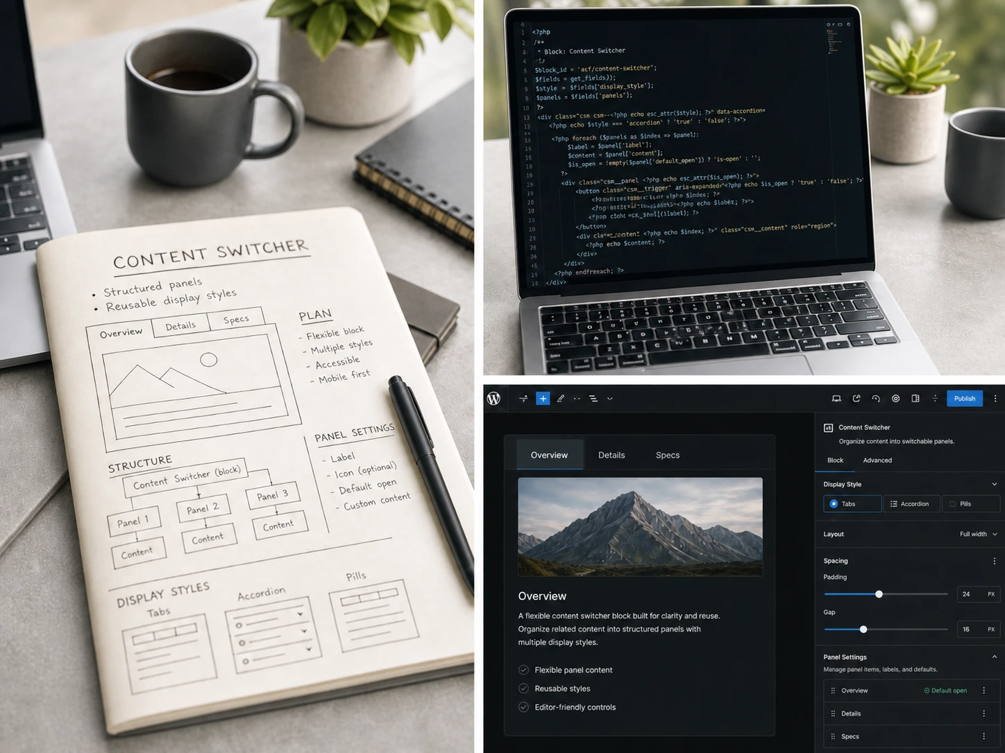
A reusable content system designed to help teams organize structured information while keeping editing predictable.
Overview
When One Page Needs to Serve More Than One Path
Some pages need to compare options, speak to multiple audiences, or group related information without making every visitor read every section. Left unchecked, those pages become long, repetitive, and hard to scan.
A switcher pattern works when the content belongs together but each path needs its own focused space. Visitors can move directly to what matters, and editors get a repeatable publishing pattern instead of rebuilding the layout for every new page.
Live Component Preview
Try it: Click the settings button to explore curated front-end controls for display style, backgrounds, and border radius. These controls mirror a small subset of the options available to editors inside WordPress.
Switch between panels to see how each section can manage its own layout, media, highlights, and buttons while staying inside the same reusable component.
Content Planning
Plan content before building layouts
Structured sections help teams organize complex information before visual styling begins, making content easier to maintain and easier for users to scan.
- Good component architecture starts with clear editorial decisions.


Content Switcher Live Controls
These controls are for the portfolio demo only. The production block is configured in the WordPress editor.
Display Style
Switcher Background
Panel Background
Panel Radius
Design Principles
Each decision in this block was made to reduce the gap between what an editor can do and what the front end actually needs to support.
Controlled Flexibility
The block exposes display style, spacing, border radius, and nav behavior as discrete options—not open-ended fields. Editors get meaningful variation without the risk of breaking the layout.
Editor-First Structure
Panels are structured content items, not freeform containers. Each one has a defined set of fields: label, icon, media, content, highlights, and buttons. That structure makes editing faster and publishing more consistent.
Accessible by Default
Tab and tabpanel semantics, keyboard navigation, and mobile accordion fallback are built into the component—not added as an afterthought. The interaction model works correctly whether or not JavaScript has loaded.
Editor Experience
Clear Editing Boundaries Without Custom Layout Work
Editors should not have to decide where the layout begins and ends every time they update a page. The switcher keeps the shared presentation in one place, so spacing, backgrounds, navigation, and responsive behavior stay consistent across every panel.
Each panel gives editors a clear place to manage the content that belongs to that path: label, icon, media, body copy, highlights, buttons, and a deep link. Panels can be updated or reordered without rebuilding the surrounding component.
Editor-only utilities, including panel labels and one-click deep link copying, support the publishing workflow without leaking those controls onto the public front end.
Implementation
Built to Stay Reusable, Accessible, and Predictable
The block separates shared presentation from panel content so editors get flexibility without one-off layout work. The front end handles accessible interaction, scoped instance data, responsive fallbacks, and reusable display variants in one dependable system.
Structured Editor Model
Parent settings control the switcher while each panel manages its own content.
Accessible Interaction Built In
Server-rendered tab and tabpanel markup supports assistive technology.
Keyboard Navigation
Arrow-key interaction follows the selected horizontal or vertical orientation.
Safe Deep Linking
Panel hashes are scoped so multiple switchers can coexist on one page.
Responsive Accordion Fallback
Small screens use a mobile-friendly panel pattern without a separate block.
Portable Visual System
Display variants share one system instead of duplicated stylesheets.
Matched Panel Height
Editors can reduce layout shift when panel content varies.
Outcome
Less One-Off Work, More Consistent Publishing
Teams using this block spend less time building custom layout sections for structured content and more time publishing. The same component handles service comparisons, audience-based messaging, feature groups, and tabbed reference content without requiring a new block for each use case.
Accessibility is built in rather than retrofitted, so there's no additional QA burden when the block is reused. Editorial control stays with the team—display style, panel content, and deep link behavior are all managed within the block editor, with no theme customization required.
See how this supports safer editing
The Editor Experience & Handoff showcase explains how reusable blocks are structured for safer content updates, guided controls, and long-term maintainability.
View editor experienceClosing Thought
Need WordPress components that are easier to launch, reuse, and maintain?
I help agencies turn complex content needs into dependable WordPress features, with thoughtful front-end implementation, guided editor controls, and production-ready behavior.