
Reusable WordPress Section
Comparison Cards
When visitors need to compare options, the content has to stay clear, consistent, and easy to update. Developed through an AI-accelerated, developer-led workflow, Comparison Cards gives editors a reusable way to manage plans, services, packages, or product options without rebuilding the layout every time.
- One editable card per option instead of dense repeater fields
- Optional pricing and feature states without rigid table markup
- Responsive comparison layouts that stay readable on small screens
- Semantic feature states use text and icons instead of color alone
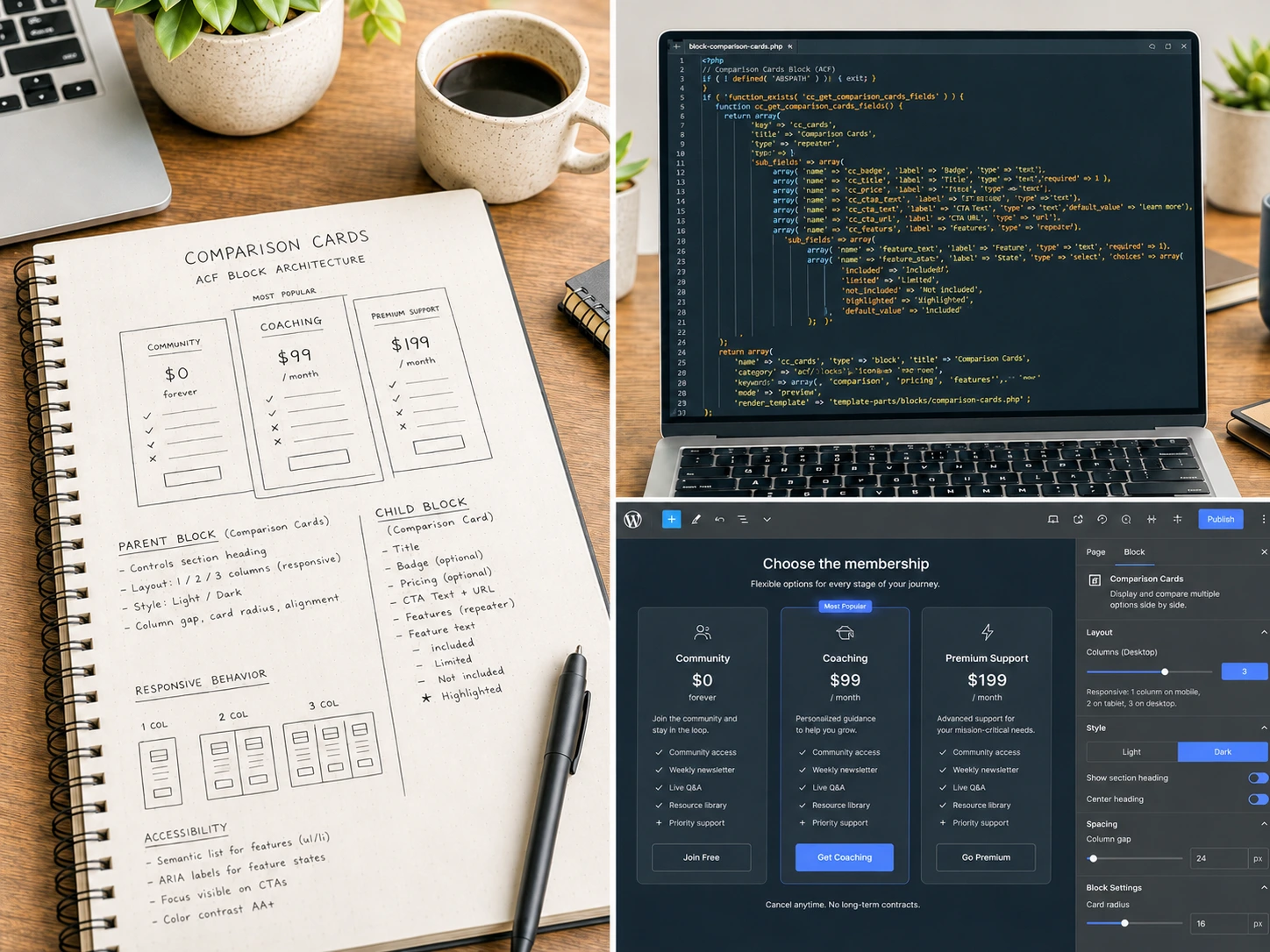
A parent/child block system—built for the canvas, not for nested repeaters—designed to keep comparison content natural to edit while staying visually consistent.
The Problem
Comparison Content Is Common, But Editing It Shouldn't Be Difficult
Comparison content is everywhere on client sites—pricing tables, membership tiers, service packages, product options. But building it often means asking editors to work inside dense repeater fields, nested tables, or overly rigid pricing layouts that feel disconnected from the actual page content.
A comparison block needs to be structured enough to stay consistent while still feeling natural for editors to update and expand.
Live Component Preview
Try it: Click the settings button to preview layout, card style, and background variants. These controls mirror a curated subset of the options available to editors inside WordPress.
Membership Options
Choose The Membership Level That's Right For You
Start Here
Community
For members who want access to helpful resources, regular updates, and a supportive community.
Included features
- Resource library with templates and guides
- Monthly member newsletter
- Access to community discussions
- Member-only updates and announcements
Limited features
- Group support during scheduled windows
- Access to live sessions when space is available
Not included features
- 1:1 coaching sessions
- Priority support requests
Most Popular
Coaching
For members who want structured guidance, regular accountability, and a clearer path forward.
Billed Monthly
Included features
- Everything included in Community
- Monthly group coaching calls
- Progress check-ins and accountability prompts
- Member workshops and guided sessions
- Priority access to new resources
Limited features
- Personalized feedback during group review sessions
Not included features
- Dedicated 1:1 strategy sessions
Highlighted features
- Recommended for members who want consistent momentum without needing a custom plan.
Advanced Support
Premium Support
For members who need direct support, personalized recommendations, and faster help when decisions matter.
Limited availability
Included features
- Everything included in Coaching
- Monthly 1:1 strategy session
- Priority support requests
- Advanced templates and planning tools
- Personalized recommendations based on your goals
Highlighted features
- Best for members who want personalized guidance and faster support when decisions matter.
Live example: A membership program comparison using Community, Coaching, and Premium Support tiers.
Comparison Cards Live Controls
These live controls are for demo purposes only. The production block is configured in the WordPress editor.
Layout
Card Style
Background Style
The Approach
One Layout. Independent Content.
The block keeps shared presentation in one place while each comparison option stays easy to manage on its own:
- The parent block owns the section heading, intro text, layout choice, card style, and background styling.
- Each child card block manages its own plan or package name, description, pricing, CTA, and feature list.
- Editors add, reorder, and duplicate cards directly in the block canvas.
- Pricing is optional, so the block works for more than traditional pricing tables—it can compare anything.
- Feature groups are semantic: included, limited, not included, and highlighted—not color-coded.
- Feature content is rich, allowing lists, descriptions, and context instead of one-line-only text.
Editor Experience
Designed for the Block Canvas, Not a Settings Panel
Editors work with the comparison directly in the block canvas instead of digging through a crowded settings interface. This keeps the editing surface focused and natural.
- No nested repeaters—cards are visible as blocks, not hidden in a field stack.
- Canvas-based controls—section and card options are accessible without leaving the editor.
- Guided card fields—each card has a clear place for its title, description, pricing, and feature list.
- Editor/frontend parity—what editors see in the canvas matches what visitors see on the front end.
Accessible Design
Feature States That Work Without Color Alone
Comparison cards often rely on color to communicate feature inclusion or limitations. This block uses semantic structure and multiple cues:
- Labeled feature groups—each state (included, limited, not included, highlighted) has a visible text label and icon.
- Strikethrough for not-included—text-decoration adds a non-color cue for items that are not part of the plan.
- Bold for highlighted items—emphasis that works across all contexts.
- Focus-visible outlines—keyboard users see clear focus states on all interactive elements.
- Contrast-conscious color choices—theme variants and featured states are designed with WCAG contrast targets in mind.
Technical Highlights
Built to Stay Reliable Over Time
- Native block management—editors can add, duplicate, and reorder cards using familiar WordPress controls.
- Responsive CSS Grid—cards move from one to three columns with intentional breakpoints.
- No JavaScript required—layout and card presentation rely on CSS and semantic markup.
- Matched editor output—Gutenberg wrapper styles are handled so the canvas stays close to the front end.
- Flexible pricing fields—prefix, value, suffix, and note fields work independently.
- Filtered feature content—rich feature copy still renders through WordPress content filters.
- Design-token theming—CSS custom properties keep visual variants portable and easier to rebrand.
Outcome
A Reusable Comparison System That Works Across Contexts
The result is a comparison block that feels polished on the front end and manageable in the editor. It works for memberships, service tiers, packages, programs, or product options—without locking the client into a rigid pricing-table model.
Editors can add, reorder, or update options without asking for a new layout each time. That keeps comparison content easier to maintain as offers change.
See how this supports safer editing
The Editor Experience & Handoff showcase explains how reusable blocks are structured for safer content updates, guided controls, and long-term maintainability.
View editor experienceClosing Thought
Need WordPress components your clients can actually maintain?
I help agencies build dependable WordPress sections with thoughtful front-end implementation, guided editor controls, and clean handoff.