Overview
Mission Control is a responsive workday dashboard that brings priorities, calendar events, deadlines, messages awaiting a response, dependencies, and tasks into one focused interface. The prototype uses fictional Slack, Gmail, Calendar, and GitHub data rather than connecting to real accounts.
The project began during master.dev's Agentic Frontend Development with OpenAI Codex workshop, hosted with Katia Gil Guzman from OpenAI. The workshop provided the initial prompt, fixture data, moodboard, and starter materials used to kick off the project. After Codex generated the first working dashboard, I continued developing it through hands-on UI/UX review, responsive and accessibility testing, and iterative refinement with Codex.
Generated Starting Point
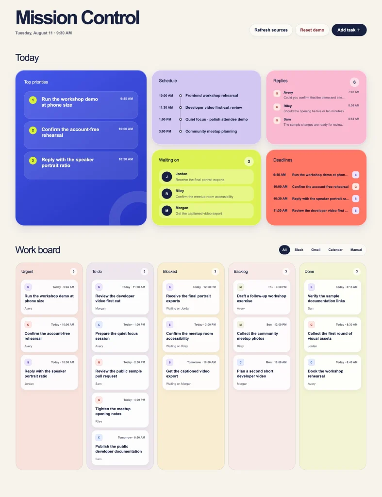
The first generated version translated the supplied moodboard into a playful bento layout with bold colors, rounded surfaces, and generous spacing. It established the core dashboard successfully, but testing it in the browser revealed opportunities to improve hierarchy, density, responsiveness, and how color communicated meaning.
First Refinement
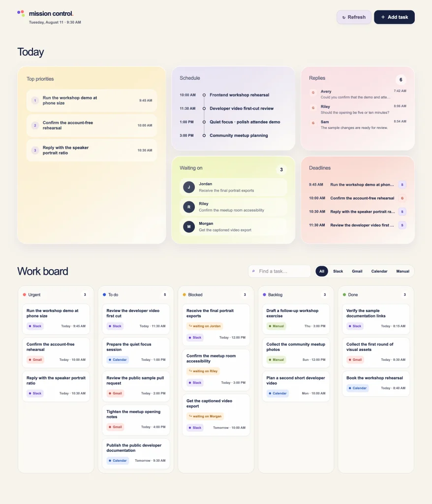
I reduced the visual weight of the branding and priority cards so the workday content became the focus. The task board moved to more neutral surfaces, while color shifted into smaller status indicators and source labels where it carried useful information. Search was added, and the five-column board was redesigned to reflow across desktop, tablet, and mobile layouts.
The result retained the softer shapes and personality of the original visual direction while making the interface calmer and easier to scan.
Improving the Interaction Model
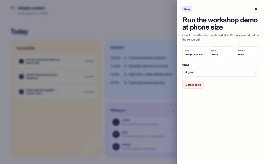
Task editing evolved from centered dialogs into contextual off-canvas panels that preserve the dashboard behind them. Add and Edit task actions use the same interaction pattern, while read-only content such as replies and calendar details expands within the dashboard instead of unnecessarily opening an editing interface.
These changes kept actions connected to their original context and reduced the number of interaction patterns someone has to learn.
Rethinking the Workday Hierarchy
As the dashboard evolved, I reorganized the Today overview around the questions someone is likely to ask at the beginning of a workday: What should I work on? Where do I need to be? What is due? What am I waiting for? Who needs something from me?
That thinking led to the final Start here, On the calendar, Deadlines, Waiting on, and Need replies hierarchy. Mobile ordering was considered separately so important information remains prioritized when the desktop layout collapses.
Final Result
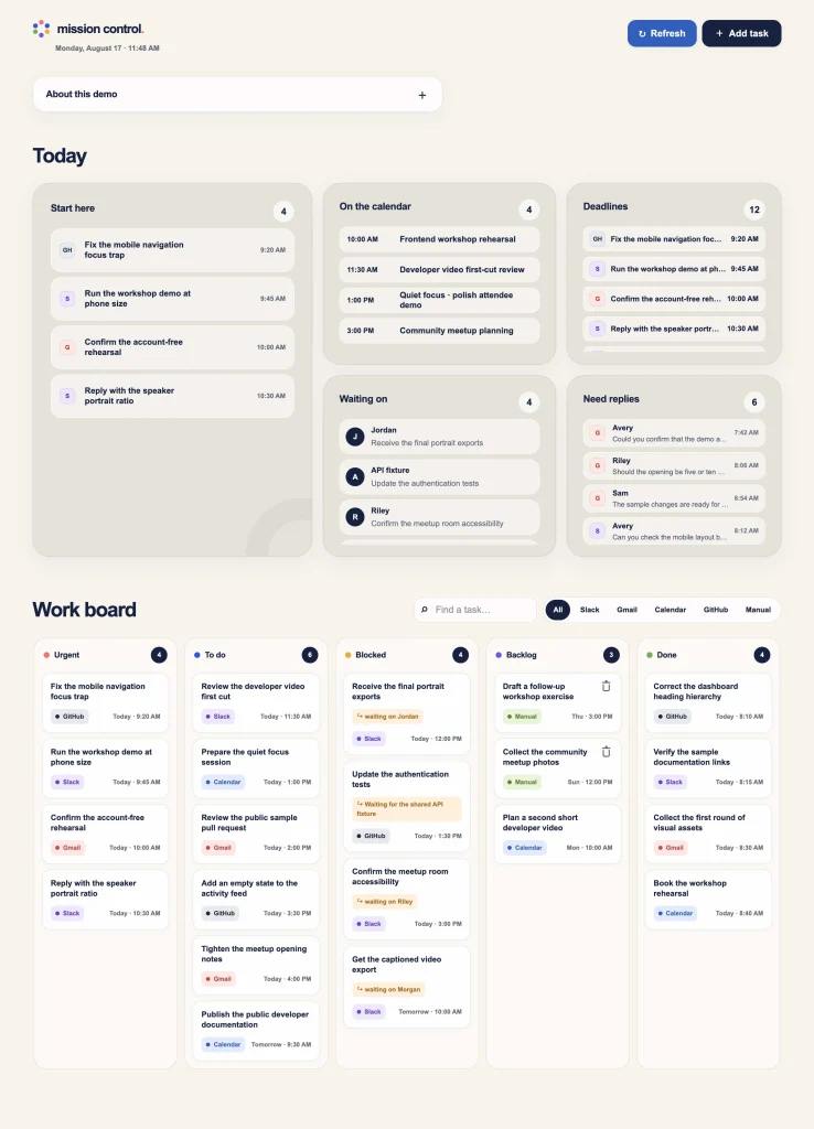
The finished prototype preserves the character and core structure of the generated starting point while making the interface more focused, responsive, and consistent. Later refinements addressed keyboard focus, scroll behavior, task persistence, source links, read-only calendar behavior, and other details that became apparent through browser testing.
Mission Control demonstrates how I approach an existing implementation: preserve what works, identify specific usability and interface problems, test changes in context, and continue refining until the experience feels coherent across screen sizes and interaction methods.