
Reusable WordPress Section
Flexible Feature Section
Developed through an AI-accelerated, developer-led workflow, this reusable feature section is designed to stay balanced with real content. Editors have meaningful layout flexibility while the underlying structure keeps every variation responsive and consistent.
- Guided layout options instead of open-ended design decisions
- Responsive media/text combinations that stay balanced
- Editor controls that protect spacing, readability, and hierarchy
- Semantic content structure stays clear across layout variations
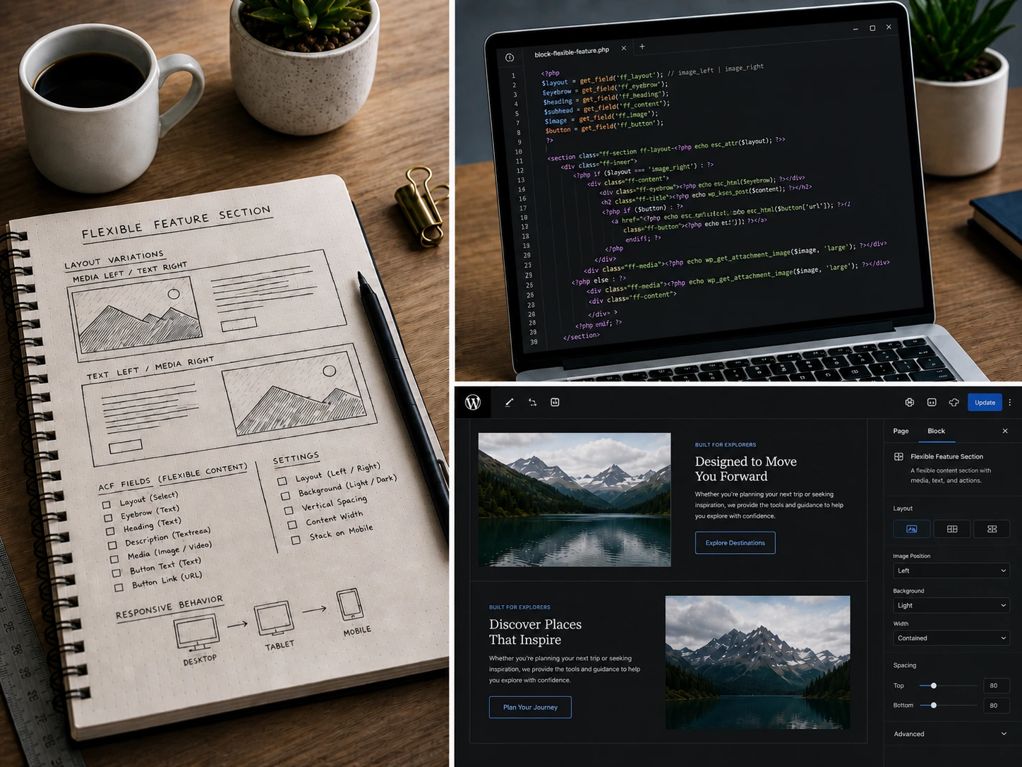
Designed to handle real copy, responsive layout shifts, and visual variation without losing structure.
Overview
A More Reliable Way to Build Feature Sections
Feature sections often become difficult to maintain as real content replaces placeholder copy. Longer text, uneven imagery, and responsive layouts can quickly introduce inconsistencies.
This component keeps the layout flexible while preventing combinations that weaken the overall presentation. Editors gain useful control without sacrificing consistency.

A Balanced Layout That Works Out of the Box
This is the default configuration, designed to work well with minimal adjustment. Content and media remain visually balanced across screen sizes, allowing editors to focus on the message rather than layout details.
Design principles
Design Principles Behind This Block
Flexible where it matters, consistent where it counts. This block gives editors meaningful control while keeping layout, styling, and output predictable across the site.
Constrain the system, not the content
Instead of allowing every possible layout combination, the block limits options to patterns that stay balanced with real content.
Design for real content first
Layouts are built to handle uneven copy, varied imagery, and responsive shifts without breaking visual hierarchy.
Flexibility within structure
Editors can change layout, alignment, and emphasis while the system preserves spacing, rhythm, and responsiveness.

These examples show how the same layout adapts to different content while preserving balance and responsive behavior.
Outcome
Flexible for Editors, Reliable on the Front End
This block was built to solve a practical problem: creating flexible content sections that don’t break when real content is introduced. By limiting invalid layout combinations and focusing on predictable behavior, it produces consistent results across a wide range of use cases.
The same component can be reused across landing pages, service sections, and internal content without redesigning layouts for each scenario. Editors get meaningful flexibility, while the structure ensures the front-end remains balanced and reliable.
Closing Thought
Need a flexible section system that still feels controlled?
I build WordPress components that give editors useful flexibility without sacrificing layout consistency or front-end quality.